publishing
If self-publishing a book, there are many variables to entice, inform and motivate your audience.
For instance
LiWhether your book is printed in colour throughout or mono throughout, or has aicolour cover and mono text pages, or whatever combination you want LiThe shape of the book—be it rectangular portrait or landscape, or maybe square. Or even something different, like triangular, or whatever LiThe number of pages your book may cover will also bring into consideration the best method of binding—like Li‘Perfect’ binding. Paperbacks are ‘perfect’ bound, though sometimes they’re not perfect, with pages falling out everywhere LiSaddle-Stitching—with staples LiCoil / spiral LiCasewrapped—alla hardback LiCasewrapped + Dust Jacket LiSomething different, something unique, etc.
Many things to think about.
Contact Steve and for you we can conceptualise something original that’ll excite, lure and evoke favourable behaviour.
Following are examples of book design :

A powerful message
communicated simply
Set for religious education, various Guides are produced by Garratt Publishing. Seen here are sample pages from the 120 page Social Justice guide—a simply delivered message on a difficult subject. Above are the front cover, contents page—showing a torn edge overlapping the colours of the indices.
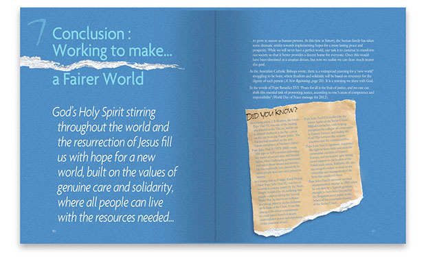
Above is a typical indice page and, below, a case study double-page spread. Torn paper was used to epitomise the roughness of ailesser life.

![]()
Walking three paths
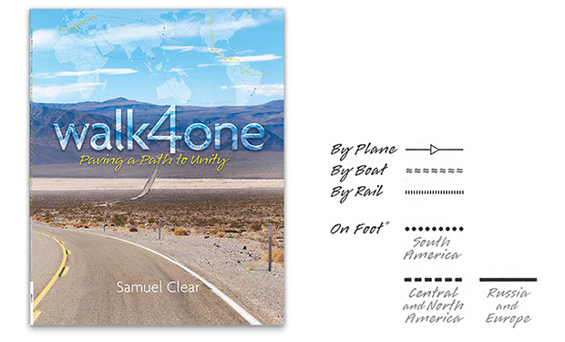
Imagine a blinding desire to walk the world—about fifteen and a half thousand kilometres—encouraging Christian unity to those met along the way. Samuel Clear from Tasmania had that desire and his resulting 340 page Book of the journey portrays the might and danger of it all.
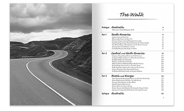 Divided into three sections of the continents travelled—South and North America, and Europe (from Moscow to Spain), the author requested black and white print to convey the arduous nature of the walk—something that was not expected.
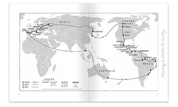 In the legends of the maps throughout (as seen above), the routes are denoted by either dotted, dashed or solid lines, the latter of which is also seen ghosted into the background of the right hand pages.
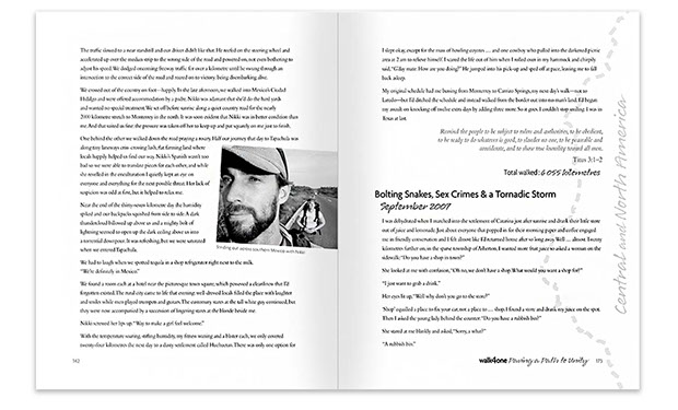 To give the book a hint of journalistic looseness, theihandwriting script Lori was added to the other fonts—Agenda for the headings and Bembo for the bodytext.
![]()
Covering a never-ending cycle
Garratt Publishing required aiPrayer Journal that gave student’s the opportunity to jot down their thoughts and reflections on individual Times/Seasons of the Liturgical year.
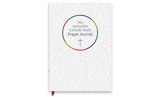
Based around the Liturgical colours seen as a never-ending cycle, each Time/Season takes its given colour—for example, purple for Advent, green for Ordinary Times and red for Holy Week, et al.
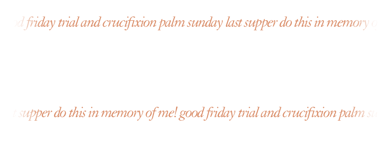
 An indice opens the section with the following pages having, at left, Scriptures, Prayers and Reflections. On the right hand side, there are lines—the latter of which are made up of page titles in colour-coordinated 4ptitype.
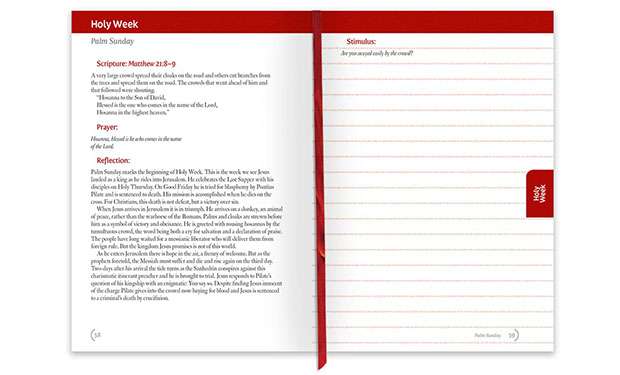
Images seen here are the front cover, the indice and example pages for Holy Week, aitypical double-page spread, and an example of colour-coordinated 4ptitype :

intro
euphoria
about
the road ahead
great design success
contact
etcetera


