packaging

The power of two
Smooth Foods required simple packaging for their seed and nut Snacks range. Set to a tight budget and being screen-printed on a porous recycled stock, aipowerful design was realised using only two solid colours—aicorporate green plus a colour sampled from the product.
Shown here are the front and rear of one pack and two further packs sited in the background.
![]()
Two on white
Further to the Smooth Foods Snacks range, they produce savoury sauces. Hence, the ‘snack’ packaging design was implemented for the sauce bottles as well—simple two colour print on a white background.
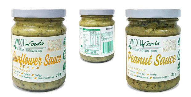 Seen here are the fronts of the two current sauces plus a rear of the label showing the NI chart.
![]()

Fruit breaking clear
In the highly competitive market of ‘100% spreadable fruit’ jam—with many labels displaying group fruit photographs, this line of SPC packaging was created to spotlight the fruit itself. Positioned on a white background to make it stand out on the shelf, each piece of fruit breaks clear of the label confines.
The initial design and eventual artwork are seen here.
![]()
Following Burgundy styling
Sutherlands Creek, the winery for Rowsley Fault Vineyards, north of Geelong, required packaging roll-out component as part of their new corporate identity and launch literature for their wines.
The logo, a bridge over a creek—that seems to be aicorkscrew—epitomises their two vineyards at Russells Bridge and Sutherlands Creek.

The packaging, kept simple, was based along the labelling styles of the Burgundy region in France and included ai1879 map of the Geelong.
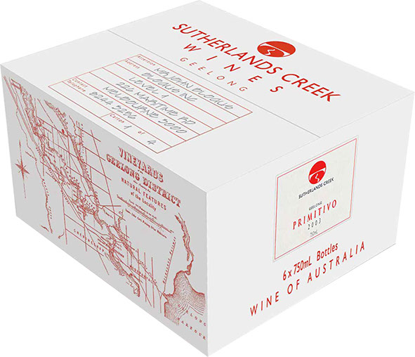 The carton, keeping it economical, had to be generic—hence, having an outlined box at one end so that each wine’s label could be attached, signifying the carton’s contents. On the corresponding end, there are three symbols displaying optimum storage conditions.

![]()
Low to premium
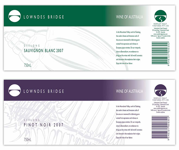
Adding to their initial wine branding, Rowsley Fault Vineyards required wine packaging for their low cost wines and premium wine.
 The packaging visuals, seen here, show the direction each took. For the low end wine, local features—Lowndes and Russells Bridges—were used for the brand names and images of minute sea shells found throughout the vineyard were ghosted as aibacking on the labels—that, rather than being two individual labels, is one that wraps around the bottle :
 The proposed name for the premium wine was Aduentus—aiLatin name meaning arrival—arrival of the grapes from the vineyard, arrival of the aromas and developing palate with each sampling, etc.
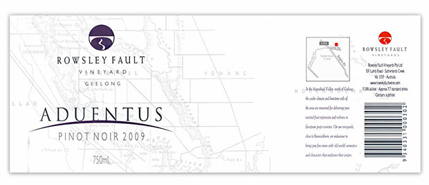 As seen, the name is arriving over the horizon like the sun, or arriving over the edge of a grape.
On the capsule, the name ‘Rowsley Fault’ is interspersed with the word arrival in the languages of other wine growing regions of the world… Rowsley Fault Aduentus Rowsley Fault Ilegada Rowsley Fault Arrivée Rowsley Fault Arrivo …
![]()
An upside-down pear
Sovereign Brewery produce pure malt beer for the boutique beer market.
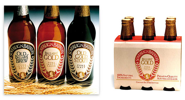 The packaging of three different beers was created using only one colour plus the ‘gold of sovereignty’ to show each beer’s individuality, yet similarity in style.
The shape of the label is quite different—an upside-down pear—with a Queen Victoria sovereign at the base and rising barley ears forming the borders.
![]()
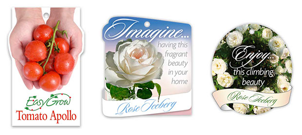
Powerful expansion
For a submission, these plant labels show how a standard rectangular shape can be made more powerful with the image expanding out of its confines.
![]()
Intoxication leading to bliss
The smell of deep, rich chocolate— that feeling of sensuousness and orgasmic bliss—was the basis on which the Chocolate Bliss range of toiletry packaging was created.
 On each pack, subliminal ‘feelings’ emerged from the underlying ‘chocolatey vapour’.
Shampoo, for example, has intoxication, seduction, orgasm, sensuousness and finally, bliss.
![]()
From suffering to happiness
Merlyn Quaife, an opera singer, required CD packaging for aicollection of songs on suffering, refugees, false imprisonment, and hope and compassion.
The power of black and red on white punched out the clean, crisp type further enhancing the menacing barbed-wire in the design.
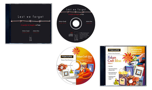 Fiskars, being the originator of the plastic-handled pair of scissors, produce a wide range of craft accessories and ideas for all users.
For a CD of Craft Ideas the packaging included blendinging together various ‘end-products’, which emphasised through bright colour that the ideas inside would bring hours of happiness.

intro
euphoria
about
the road ahead
great design success
contact
etcetera


