brochures …
Though like books, brochures have less pages and a more direct message or ‘story’ to tell. These are some of the brochure varieties :
Lidouble-sided brochures
Liannual reports Linewsletters Licatalogues Librochures with gatefolds (extra pages folding into the main section) Li‘DL’ brochures (aiA4 sheet folded twice to make aimini brochure to fit into aiDL envelope), etc
Following are examples
of brochures :
One success leads to another
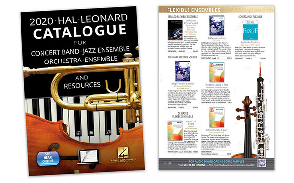
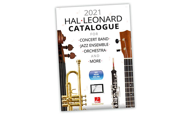
Enhancing the Hal Leonard annual catalogue for schools with large images of instruments led to such success that the concept was utilised again with airejig of the components. “Make it similar but different” was the brief.
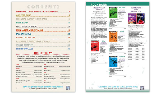
Seen, above, are the front and a page from the 2020 catalogue showing the instruments. Below are the front of the 2021 version, the contents page with entries colour-coordinated to the pages, following.

intro
euphoria
about
the road ahead
great design success
contact
etcetera
![]()
The benchmark to beat
A Call for Entries brochure is created annually to entice urban developers, builders, town planners and others from the civil engineering fraternity into submitting for a coveted UDIA Award.
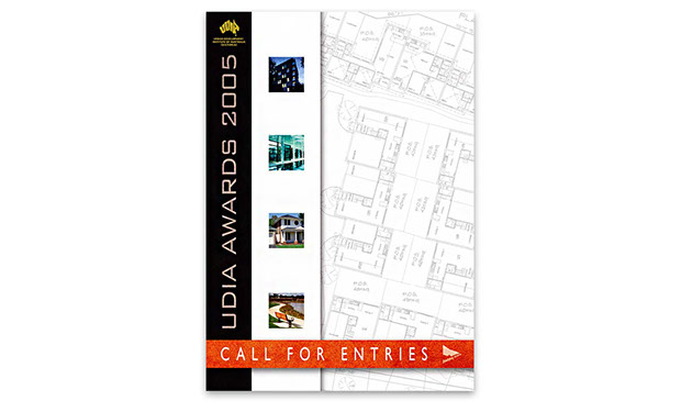
Seen here is a Call for Entries brochure, showing the front and the brochure opened, showing the gate-folded entry form.
 Throughout are images from the previous year’s Award Winners, suggesting that they are the benchmark to beat. Further imagery shows architectural plans and structural textures.
![]()

Enlivening civic growth through nature’s textures and patterns
An annual report for the Urban Development Institute of Australia was created around textures and patterns found and built into the landscape of housing estates—steel, wood, stone and the natural environment of rocks, reeds, water, leaves and clouds.
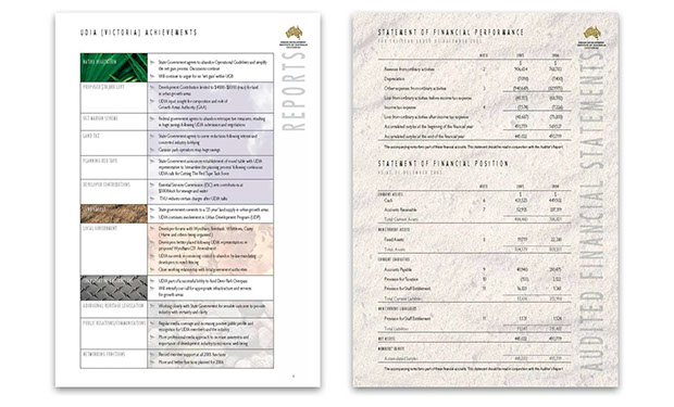 Throughout the annual report, these textures were used as backgrounds, particularly so as the backing for the financial section, seen at right.
![]()

A yearly report on
community relationships
The Inner Northern Local Learning &iEmployment Network build partnerships between students and potential employers, within theiCities of Moreland, Darebin and Yarra.
 An annual report was created around INLLEN’s audience—employers, schools, unions, Koori communities—and based around circles seen in their logo. Aimap of their area, which, by chance, forms a square, appeared throughout as page backgrounds, as on the front and financials, and the contents page, above.
![]()
Bibles and brochures
Twice annually members of the television industry meet at Cannes, France for their ‘market’, where proposed shows are presented and can be bought and sold.
At their meetings, producers offer aidouble-sided teaser brochure with an outline of a show proposed. If there’s serious interest, a bible is offered—detailing the show’s background, synopsis, characters and possible episodes.
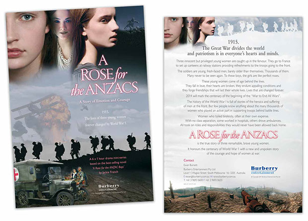 Seen here is a double-sided teaser brochure for Burberry Entertainment, where imagery sourced from the internet, was photoshopped together, creating an enigmatic mood of war, sadness andihope.
![]()
Wintery effects produce catalogue gold
The Henry Buck’s Men’s Attire company markets merchandise through minor advertising and aiseasonal mail order catalogue.
Because their garments are the ultimate in style and fashion, the printed hues of each have to match the physical product. Hence, exemplary colour correction and image retouching are essential.
 This Autumn & Winter catalogue was printed offset ensuring pristine colour throughout. Faint ghosted images of an autumn leaf appeared on various pages leading to the gate-folded order form at the rear.
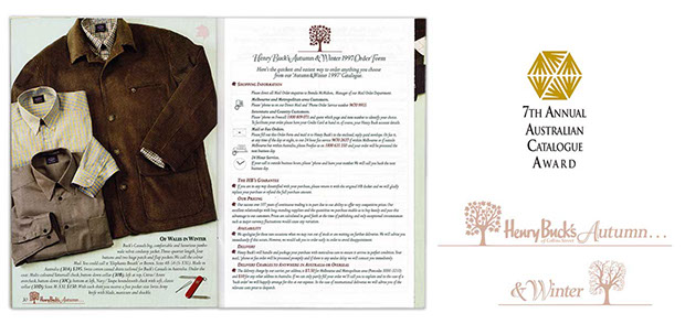 Using a tree selected from the ‘tie’ cover image, page number motifs were utilised as well—on the left, a tree in leaf signifying Autumn while on the right, the tree without leaves, that being in Winter.
![]()
From scrap to billet
The only steel smelter in Australia that solely utilises recycled scrap is Smorgon Steel. From billets, the steel is rolled into flat, round and angled products for the automotive, construction and other industries.

Seen here are the front cover and aitypical page from their corporate brochure and product catalogue, with products represented throughout as flat, round and angled symbols. 
The front inner image on the cover is a blend of various shots to show a gradation from scrap to billet.


